What is a Horizontal Rule? A Guide by Discoveringly for Canadians
A horizontal rule is a simple yet effective element in web design and content formatting, widely used to improve readability and structure. In essence, a horizontal rule is a line, often extending across the full width of a webpage or document, that visually separates content sections. For Canadian website owners, bloggers, and content creators, understanding how and when to use a horizontal rule can significantly enhance user experience on your site. This guide by Discoveringly explores the purpose of horizontal rules, when to use them, and why they’re essential for Canadian websites.
1. Understanding the Basics of a Horizontal Rule
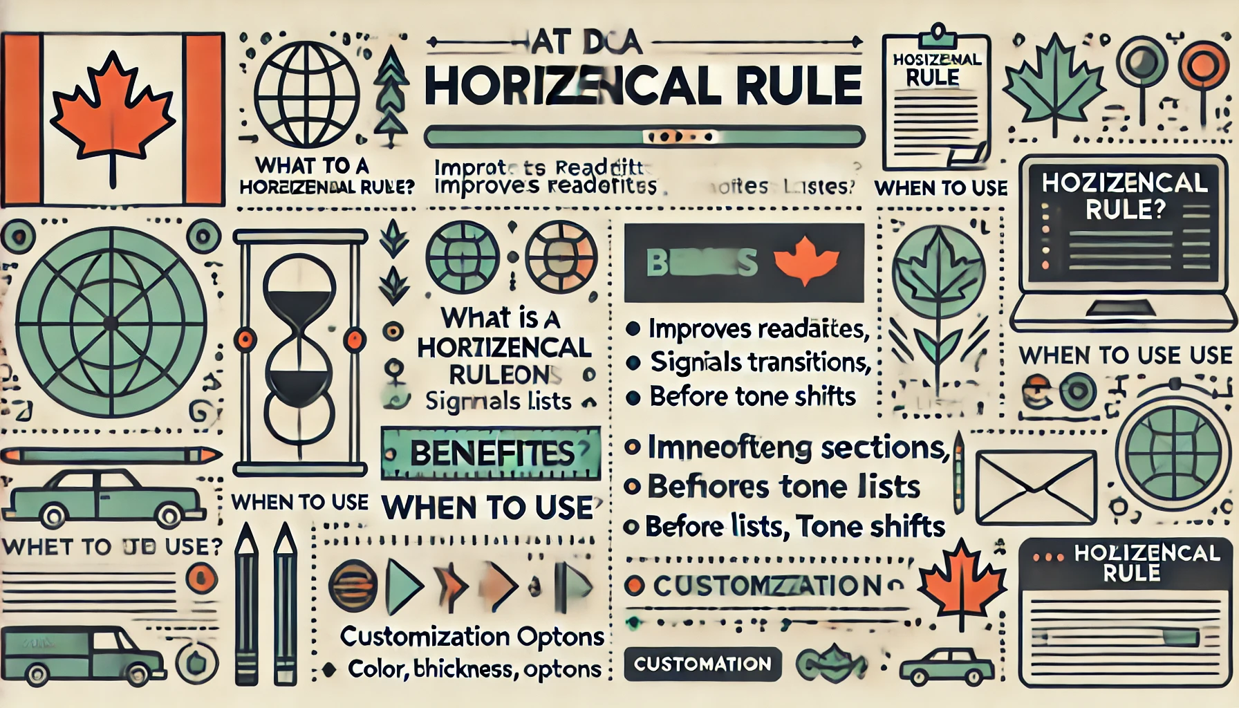
A horizontal rule (often abbreviated as HR) is a design element that acts as a divider between sections of text or content. While it may look simple, the horizontal rule serves several practical purposes that go beyond mere aesthetics.
What Does a Horizontal Rule Look Like?
Typically, a horizontal rule is a straight line, spanning the entire width of the screen. In HTML, it’s created using the <hr> tag, making it accessible and easy to use. Many content management systems (CMS) and website builders include horizontal rule options that allow users to customize line style, width, color, and thickness. The default style is usually a thin, light gray line, but this can be modified to align with a website’s brand colors and theme.
Why Use a Horizontal Rule?
Horizontal rules provide structure, making your content more scannable and easier to navigate. By breaking up large text sections, they help readers focus on key information and move smoothly from one topic to the next. They can guide readers through the content and visually signal shifts in topic or tone.
2. How Horizontal Rules Enhance Canadian Websites
For Canadian audiences, online content should be engaging, organized, and user-friendly. Horizontal rules help accomplish this in several ways:
Improving Readability
In the age of digital media, most readers tend to skim rather than read every word. A horizontal rule can break up blocks of text, making it easier for readers to find specific information. By using horizontal rules strategically, Canadian websites can improve readability and ensure that readers stay engaged.
Signaling Transitions Between Sections
Horizontal rules are especially effective for dividing sections that discuss distinct topics. For instance, if a Canadian financial website is discussing tax tips, a horizontal rule can separate each tax tip for easy navigation. This method is particularly helpful for organizing articles that cover several points or ideas under a single theme, such as travel tips for Canadians or step-by-step guides.
Highlighting Key Information
Adding a horizontal rule before or after an important piece of information draws attention to it, subtly encouraging readers to pause and take notice. This can be useful on Canadian e-commerce sites when emphasizing key features, payment methods, or return policies.
3. When to Use Horizontal Rules on Your Canadian Website
While horizontal rules are versatile, using them effectively requires thoughtful placement. Here are some situations where a horizontal rule can enhance your site’s readability and visual appeal:
Separating Major Topics or Sections
If your webpage covers several major topics, using a horizontal rule between each one can give the page a clear structure. This technique is helpful on informational or blog sites, like Discoveringly, where readers may be looking for specific sections within a post.
Before or After Lists
Lists, especially lengthy ones, can sometimes blend into the rest of the text. A horizontal rule placed before or after a list helps define its boundaries and keeps it visually distinct from other content.
Signaling a Shift in Tone or Theme
When transitioning from one tone or subject to another—such as moving from a formal introduction to a casual FAQ section—a horizontal rule can signal this shift. This is particularly useful for Canadian blogs or informational sites that cover diverse topics.
Organizing Contact or Actionable Information
For Canadian businesses, horizontal rules can separate actionable information, like contact details or calls to action, from the rest of the text. This approach ensures that essential information stands out to readers, enhancing usability.
4. Customizing Horizontal Rules for Canadian Websites
Horizontal rules don’t have to be uniform. Most modern website builders allow customization options that can make the horizontal rule align better with a brand’s design.
Style Variations
You can change the style of a horizontal rule to create a different visual effect. Options include solid, dashed, or dotted lines, each bringing a unique feel to the layout. For example, a solid line might give a strong, assertive feel, while a dotted line can lend a lighter touch.
Thickness and Length
Adjusting the thickness and length of the horizontal rule gives you control over its visual impact. A thicker line can make a bold statement, ideal for important section breaks. Shorter horizontal rules are less intrusive and work well for minor breaks.
Colour Customization
Using a colour that matches your brand palette adds cohesion to your design. Many Canadian sites incorporate national colors like red and white, or colors that match the seasonal landscape, like greens and blues.
5. The Benefits of Horizontal Rules for Canadian Readers
Canadian readers are often looking for content that is concise, informative, and visually appealing. Horizontal rules help provide a structured reading experience and improve overall accessibility.
Enhancing Accessibility
Horizontal rules improve accessibility for users with cognitive disabilities by breaking down content into easily digestible sections. This makes your site more inclusive for all Canadians, enhancing user satisfaction.
Improving Mobile Experience
With the high use of mobile devices across Canada, horizontal rules are essential for mobile readability. On smaller screens, blocks of text can feel overwhelming; horizontal rules allow users to scroll through content more comfortably.
6. How to Add a Horizontal Rule on Discoveringly and Other Platforms
On Discoveringly, as with most content management platforms, you can add a horizontal rule with a simple click in the editor. Here’s how to add one on various platforms commonly used by Canadian websites:
WordPress
- In the editor, click on the “+” button to add a new block.
- Select “Separator” to add a horizontal rule, and customize as desired.
Wix
- In the Wix editor, go to “Add” and choose “Line.”
- Select the style and adjust the size, length, and color to match your site’s design.
Shopify
For Shopify store owners in Canada, the easiest way to add a horizontal rule is through HTML. Simply insert <hr> where you want the line to appear in your product or page description.
Custom HTML
In HTML, you can add <hr style="border-color: #ff0000; border-width: 2px; border-style: solid;" /> for customized styling, changing the color and width to match your website’s theme.
7. Examples of Horizontal Rules in Canadian Websites
Horizontal rules are commonly used on Canadian sites to enhance the layout and readability of content. For example:
- News Websites: Canadian news sites use horizontal rules to separate articles within a news section, keeping stories distinct and easy to navigate.
- Educational Blogs: Canadian educational blogs use horizontal rules to break down complex topics, helping readers focus on individual ideas.
- E-commerce Sites: Many Canadian e-commerce sites use horizontal rules to highlight key information, such as shipping policies or product features.
Conclusion
Horizontal rules may seem like a simple design element, but they play a powerful role in structuring content and enhancing readability. For Canadian website owners, understanding how to use horizontal rules can create a better reading experience, improve navigation, and make information easier to digest. At Discoveringly, we recognize that small design choices like these can make a significant difference for Canadian readers, allowing them to enjoy a well-organized, visually appealing site. So, if you’re looking to upgrade your content’s readability and appearance, consider adding horizontal rules to your website’s design toolkit.